Being married to an artist is great. Sometimes she’ll drag you to a Leonardo Da Vinci exhibit, and other times she’ll make you watch the Next Great Artist reality programme. The latter might sound terrible, but I got sucked in big time because they asked the artists to design a book cover. But, truth be told, I wasn’t a fan of the winning cover.
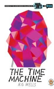 Contestant John Parot designed this cover for H. G. Wells’ The Time Machine, but it doesn’t work as a book cover for me. It looks like nothing more than a colour pattern, yet it won where other, more relevant and less colourful, efforts were left by the wayside. The reasoning seemed to be that you could see the cover across the book shop.
Is that the only criteria for a good book cover these days? Never one to leave a question unanswered, I’ve garnered feedback, done the research, and this is what I’ve come up with so far:
1. Remember the size
In these days of online shopping, a book cover is displayed as a small thumbnail. That means images and text need to be readable at small sizes. For this reason, make the title large, don’t use overly decorative fonts and make sure the cover still has a strong focus.
2. Keep it simple, make it bold
Few articles about book cover design fail to make mention of the Twilight Saga covers. But they get mentioned for a reason: they’re striking and they grab the attention through high contrast and simple design. You don’t have to copy the style but you can borrow the lessons. The cover’s job is to grab the attention instantly. Big, bold images can do that.
3. Don’t be afraid of your demographic
If you’ve written a fantasy novel, does the cover design appeal to fantasy readers? If the cover doesn’t encourage them to buy it, is it really going to encourage anyone else?
4. Avoid stock photos
I know a lot of indie authors swear by stock photography, but let’s be honest: it sticks out like a sore thumb and screams amateur. Commission some original art. It’s worth the investment.
5. Avoid too much symbolism
Yes, the violin is symbolic of your hero’s quest to be heard by his peers, but a stonking great violin on a book cover will tell people that this is a book about violins. If they don’t like violins, they won’t pick it up. Symbolism is great in the text, but the cover is pure marketing; its only purpose is to encourage a customer to buy it.
 6. Read Joel Friedlander’s Book Designer Blog
A bonus tip! Joel Friedlander’s Book Designer site is a fantastic resource for anyone who is looking to self-publish a book; it’s brimming over with information. Book cover design is just one aspect of the things he examines, but you should definitely start reading it now.
 Does the cover design of The Fey Man follow this advice? Let me know what you think. And why not pick up your copy today?
★★★★★ – “A must read for fans of epic fantasy”
The Fey Man is available now from Amazon, Apple, Kobo, and Smashwords